Green is the most common color in nature, but is underestimated in interior decoration. This is probably due to the difficulty of choosing the most pleasant combination of green with other tones. Designers have learned to use most shades of green, choosing the perfect combination for them. But it is always used in dosage, adhering to certain recommendations.
It is difficult to match the color to green
Green is not very popular in decoration
Using green color in the interior, you need to adhere to the recommendations
Green is the most paradoxical color. It belongs to the cold range of the spectrum, but it is the "warmest" of the cold ones, with the exception of the shade of arctic ice. Therefore, several indoor plants are able to revive and give a special aura of hospitality, even in the living room in gray or black and white tones.
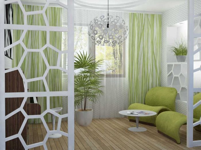
In the interior of the hallway, the combination of light green color with other natural shades is well perceived. In the bedroom, children's and teenage room, not only pure natural tones are appropriate, but also mixed ones:
- the color of milky greens (like poplar buds);
- yellow-green (young anise, unripe lime);
- blue-green (aqua).
This color has the largest number of natural shades, the names of which some peoples have, but in our language there are no analogues or translation. Most often they are associated with those plants or fruits that are unknown in our latitudes. More recently, we learned what the shade "lime" or "blue agave" is. Some Amazonian tribes do not have a distinction between turquoise, light green and blue - this is "deep water".
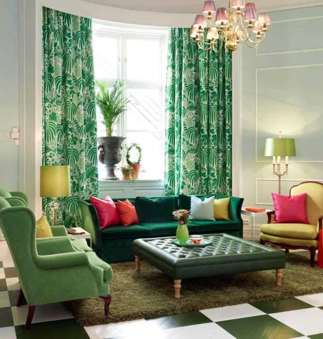
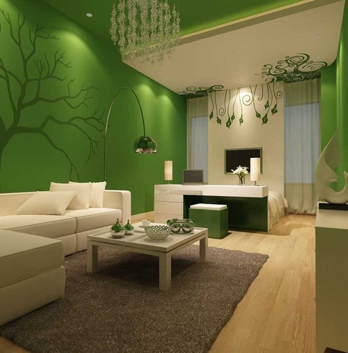
In our language environment, the names "onion", "pea", "pine" or "gasoline" are not used. They sometimes appear in foreign clothing catalogs after a literal translation. Pine needles are a favorite color of Norwegians and Swedes. Dark green (needles) with white and blue is a natural combination, this is the “northern three”. This trio is often featured in the interiors and upholstery of IKEA upholstered furniture in the spirit of Scandinavian minimalism, as in the photo.
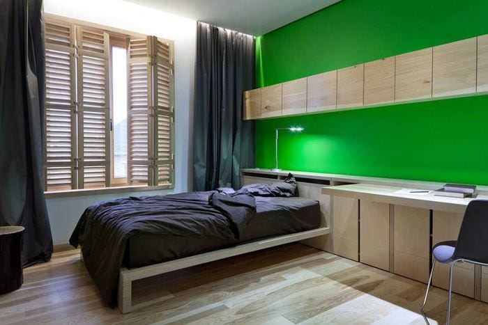
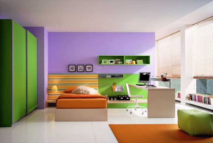
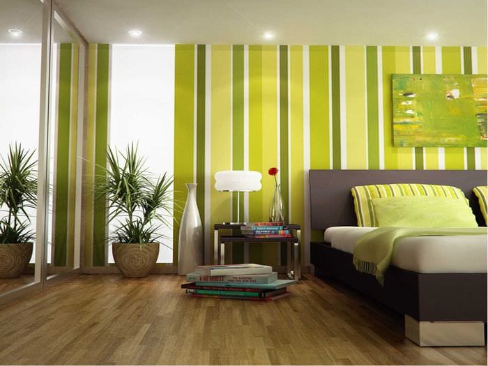
In the bedroom, green will look great
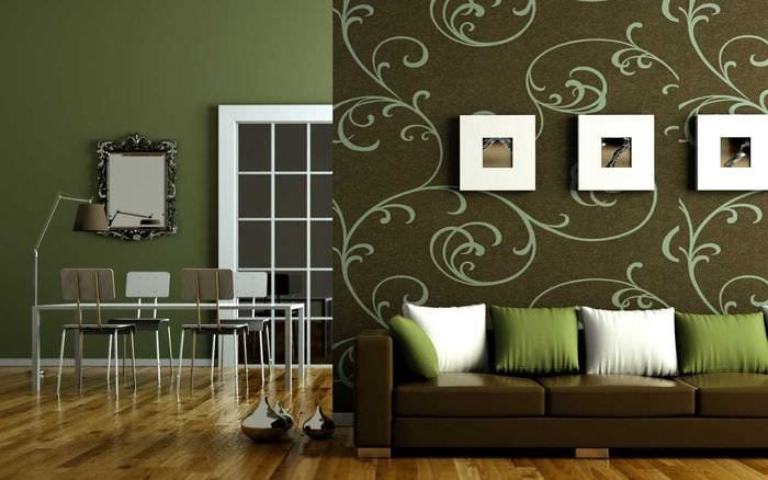
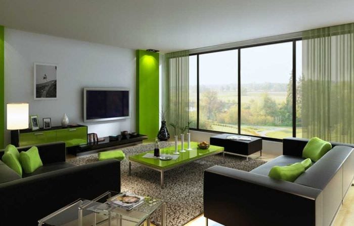
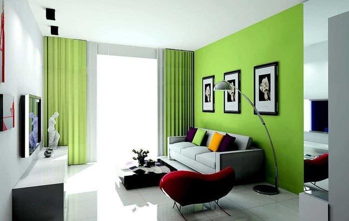
The combination of green and chocolate colors in the living room interior will create a special atmosphere
Human vision is able to distinguish hundreds of shades, identifying in the mind in images. Not all are used in the interior of the apartment. The color of the cloth in the mahogany billiard room is a sophisticated English classic.
The expression "longing green" refers to the color gray-green. It is undesirable to use it in the personal space of people prone to depression and at the crib of crying children. It will not be useful in the office of creative people either. But emerald and aqua are able to awaken deep creative layers, if combined with silvery green.
"Poisonous" green fences and entrances, painted corridor panels in schools and kindergartens of the Soviet period are the most unpleasant color. For many, he discouraged the desire to use more aesthetic shades of green in their homes and apartments.
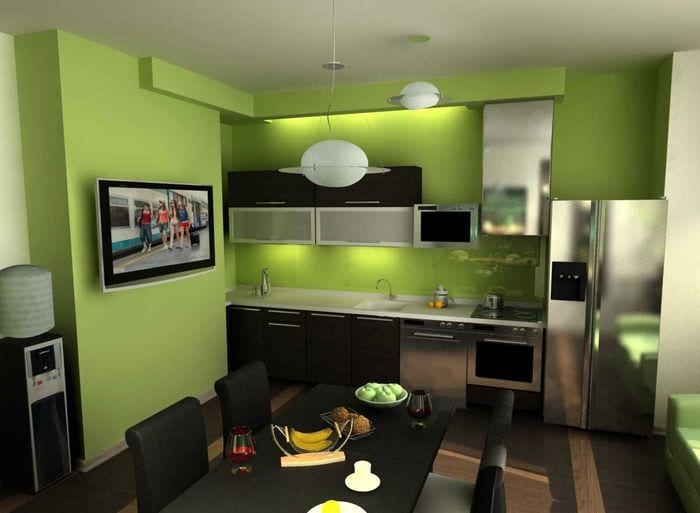
No one will give up cozy modern kitchen furniture with a green apple or cold mint facade. They evoke pleasant sensations and "appetizing" associations, are successfully used even in fashionable clothes, but they are not suitable for every face color type. But these tones can be easily combined with shades of greenery and with other colors in the interior of a modern kitchen.
Most green shades are bright, rich and cheerful in perception. They do not tire, do not overload, on the contrary, they reduce the tension from the visual analyzers. Therefore, psychologists recommend that people with a colossal load on vision and intelligence use photo wallpaper in the recreation area. It is better to choose paintings with natural landscapes that evoke pleasant sensations, or with well-groomed corners of landscape design. This is one of the reasons why this color should be present in the interior of urban "stone jungle".
Green color in the interior should be used in moderation.
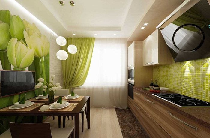
Green curtains in the kitchen will perfectly complement the interior
Most green shades are bright, rich and cheerful in perception.
Another reason is that a person lacks proximity to nature for normal existence and psychological relief. The townspeople experience this need on a subconscious level. Therefore, everyone (to a greater or lesser extent) needs indoor flowers and pets, in a combination of natural shades with green in the interior. Household animals, succulents or orchids can help relieve stress and bring yourself back to normal.
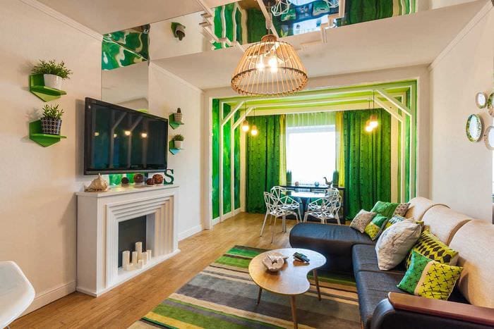
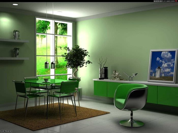
Variety of green shades in urban interiors
Natural shades evoke pleasant memories, nostalgia for the happy times of rural childhood, they invite you on long journeys. Among different peoples, this color symbolizes hope and tenderness, health and longevity. Therefore, for most ethnic groups, a combination of green and terracotta, heavenly blue and sun rays are present in the décor of the home. It is desirable to take these tones for interiors in an urban environment.
Professional decorators, colorists, florists and designers know the properties of the shades of this color. They skillfully use a combination of different colors with green, transforming old apartments beyond recognition, where you get a positive charge every day.
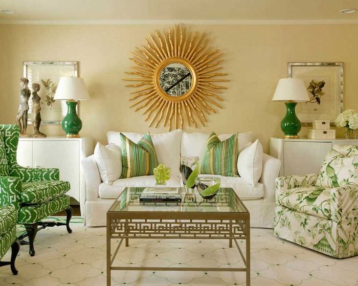
Green goes well with other shades
Green looks great in modern design
The most suitable shades for interior design:
- olive;
- emerald;
- jade;
- light green;
- mint;
- lime;
- dark green;
- herbal;
- green apple;
- turquoise;
- khaki (protective or military);
- yellow-green (anise);
- arctic ice color.
The "color of life" is obtained by mixing two spectral tones - blue and yellow (sky and sun), which enhances their interaction. Experts consider it a symbol of the distant energy of the stars and untapped potential.
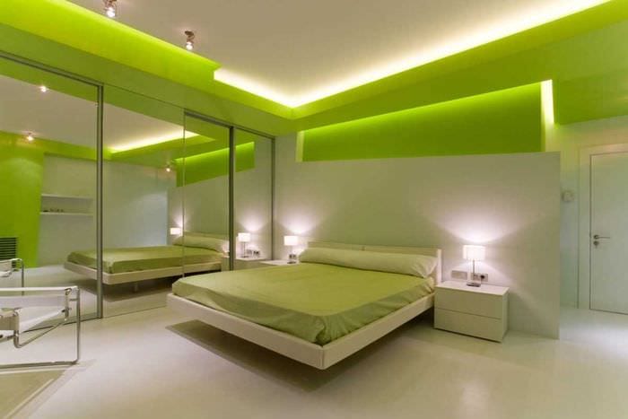
It is recommended to use "cold" diode illumination as local lighting, for example, in a bedroom, dressing room or hallway. The green "light of hope" returns clarity of thought and the energy wasted during the day, especially after water procedures in the green interior of the bathroom.
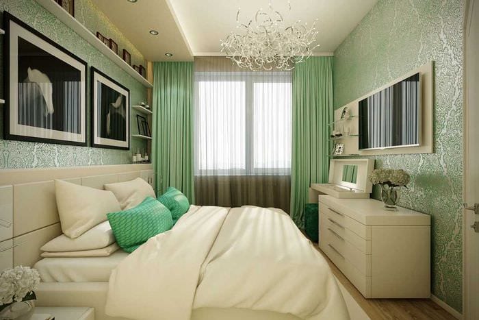
Moderate use of green in the interior of the bedroom will create a pleasant atmosphere for relaxation.
Green pillows in the living room will perfectly complement the interior of the room.
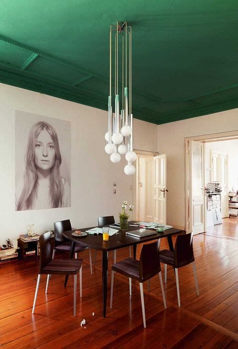
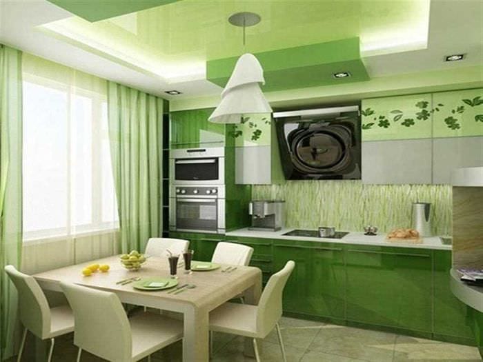
The green ceiling in the dining room will look unusual and beautiful
How to choose shades of green?
A noble combination of light green with white, beige and brown is ideal for a modern interior, but other options cannot be ignored.
Basic rules for using the color palette.
|
Main tone or background (floor, ceiling and walls) |
It is advisable to take light, blurry and neutral tones - this is the atmosphere |
|
|
Companion colors |
Different, create general harmony, preferably equally saturated |
|
|
Contrasting colors |
Dark, add variety, create patterns, visually expand |
|
|
Emotional accents |
Bright, make the interior interesting, memorable, attractive |
|
|
Colors for balance |
Calm spectral colors, diluting the monochromatic design |
|
|
Closely related shades |
Variations in predominant color, mixed or pure |
|
|
Personal preferences |
Multiple items in your favorite color add personality |
Attention! When choosing a color, remember that it is better to choose a dark bottom and a light top - a subconscious sense of stability (like earth and sky). Emotional accents - opposite the eyes in the relaxation area. If life is too busy, then the interior decor should not overload perception.
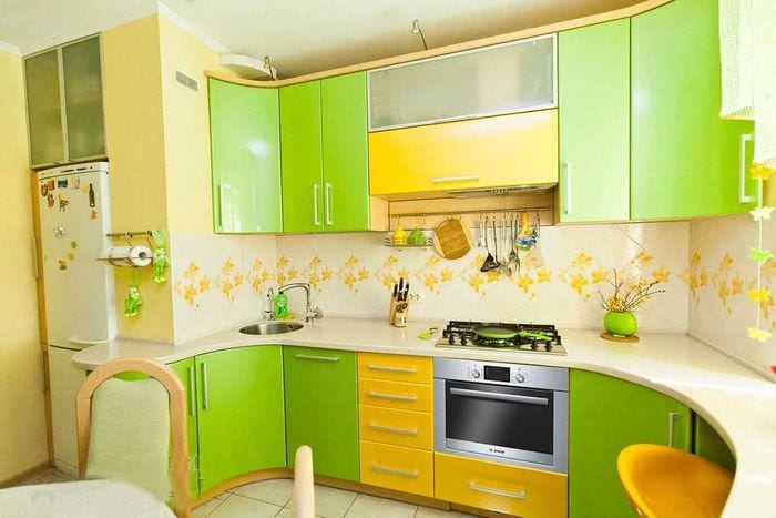
Such a combination of colors in the kitchen will give only a positive mood.
Green goes well with almost all colors
For example, in a green matrimonial bedroom, you can take dark brown parquet flooring, a white ceiling and mint or light green walls. The room will be complemented by beige curtains, white furniture and decor in green tones. Favorite pink or lilac color - orchids or flowers in a vase. An emotional accent is a painting on an empty wall or behind the headboard. Night illumination of a green LED strip along the perimeter of the ceiling will complement the magic of an intimate setting.
Advice. Everyone has their own favorite palette, but it's worth considering:
- "Cool" shades are suitable for rooms on the south side;
- more "warm" in perception - for northern windows;
- “Edible” greens are suitable for the eating area;
- neutral colors - in the recreation area;
- natural tones are appropriate in a children's room, suitable for a work area or office.
Whatever the choice, there is a lot of green in the living space - overkill, although it is an "anti-stress" color. The exception is the greenhouse on the insulated loggia and any shades of green in the hallway, where they do not stay for a long time, but are immersed in the atmosphere of the house. In the overall balance of interior design, not only the tones of surface cladding and textiles are involved, but also living greens.
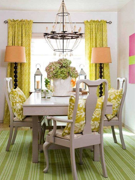
Yellow curtains and a green floor will look great in the dining room.
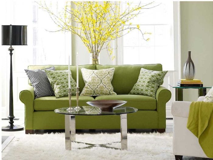
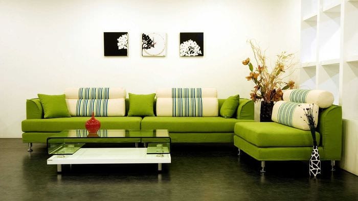
A green sofa against a background of white walls will stand out very well
Green color in the interior should be in moderation
Choosing colors that go with green
Each designer has their own list of tones that go well with green, but you can complement it to your liking. Green is a universal color, it is associated with spring and youth, it has several beneficial combinations in the interior.
Ideal companions for many shades of green.
- White (milky) and blue.
- Beige and brown.
- Peach and yellow.
- Blue and turquoise.
- Sandy and almost all woody shades.
Green is a universal color, it is associated with spring and youth, it has several beneficial combinations in the interior.
Attention! You can also choose the right combinations based on personal preferences and your own taste. Olive tones with lavender, mustard and blue are often recommended in the Provencal style. But this "classical quartet" will not be perceived in any other style.
The ideal interior option would be a light top and a dark bottom.
You can choose the color according to your preferences
There are favorites for different stylistic decisions:
- Provence is olive;
- English classics - the color of the billiard cloth;
- futurism - neon green;
- avant-garde - acidic;
- Eastern - emerald;
- safari and colonial - khaki, etc.
In the interior, light green (warm green) and mint (cold green), yellow-green, and emerald green (rich dark green) are perceived positively. In most cases, shades of fresh greens combine well:
- with gold and silver;
- with yellow and white;
- with brown and beige;
- with lilac and purple;
- with pink and lilac;
- with red and burgundy;
- with chocolate and black color.
If the rules or experts prescribe this or that color combination that causes unpleasant associations, it is better to abandon them in favor of more pleasant and relaxing combinations.
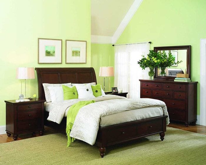
In the bedroom, green will create a pleasant atmosphere for relaxation.
Lighting in the room plays an important role
In what styles are green shades appropriate?
Juicy, optimistic shades of fresh greenery can ennoble and revitalize any urban space. Even if a high-tech or loft is chosen, a few large plants or a large aquarium with green aquafits will transform them beyond recognition, providing them with "live" power. But each style dictates its own rules. Natural shades of greenery are most appropriate in minimalism, country and ethno, new combinations offer avant-garde and futurism, kitsch and eclecticism.
- In an urban environment today it is very fashionable to decorate apartments in eco-style, where they use a natural palette and natural materials. These are wood, bamboo and cork, natural and "wild" stone, floors - with laminate in the color of wenge wood (chocolate tones). In the bathroom and hallway - marbled or porcelain stoneware tiles with imitation of natural textures. All herbal shades are used.
- Japanese minimalism is the simplest and most organic style with emphasized asceticism and a preference for natural textures. Bamboo greens and cherry blossom twigs are favorites of the decor. Bonsai and paintings of the corners of Japanese nature are widely used, but in each room there is only one. Style with a minimal color load, where instead of bright color accents there are images of hieroglyphs, a collection of dishes or edged weapons. Simple geometric shapes, simple color combinations, against a white background, with woody and green hues.
- Romanticism, retro style and country style, where they are presented in the form of floral ornaments, are also inconceivable without natural shades of greenery. Textiles in small flowers, satin stitch and cross stitching, homespun textiles and handmade tablecloths - greenery is used everywhere. Ornament on rugs and bedspreads, curtains and removable covers on furniture is also not complete without natural colors. The most luxurious shades of green are presented with yellow and pink, red and blue.
- An exciting combination of green with other shades is acceptable in eclectic style, avant-garde and futuristic interiors. Acidic, intense and provocative shades should still be used in doses, in the form of accents or extravagant decor. In the bedroom, you can focus on spectacular lighting and objects of an original form. My favorites are neon green, which is in harmony with white and lemon, especially if it's textiles.
- In the modern style, generated by the technogenic era, which suppresses ecology, natural greens are used in the form of small "oases" against a gray background. They liven up chrome and plastic surfaces, white walls and eco-leather upholstered furniture. Lighting design is popular, but remember that LED lighting distorts the natural hues of light green walls. They will be perceived differently during the day and evening. It is important to choose the decor and color accents correctly, showing taste and a sense of proportion.
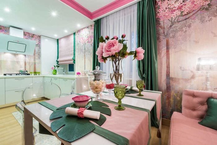
Green goes well with pink
Green goes very well with many styles
Bright shades are out of place in the historical style and in the classic interior. Showing the whim “but I like it” ”, you can spoil the impression of the most refined interior in the Baroque, Renaissance or Empire style, where the“ anti-stress color ”is used in doses. Most often, it is present in the form of a pattern on tapestry or other textiles.
When decorating an author's interior, it is better to be careful in combination with black and purple, as well as with bright shades - fuchsia, orange, red and crimson. When decorating common rooms, it is important to consult with other family members so that the chosen combination of green with other colors does not annoy anyone. Explore exquisite combinations using the examples of our photo gallery.