Not only the energy of the room and the arrangement of furniture, but the combination of colors in the interior affect the feelings it evokes. Being in one room, you can feel harmony and tranquility, while the other, on the contrary, causes unpleasant and difficult sensations.
How to learn to combine colors.
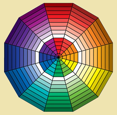
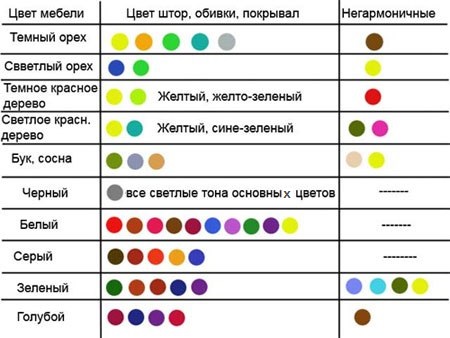
It's no secret that colors and shades are divided into warm and cold, dark and light, muted and bright. Muted colors are also called pastel colors. What are the rules for combining colors in the interior? In response to this question, a table was developed for monochrome color use, a combination of two, three or more colors. The lines in the figure connect matching colors and shades.
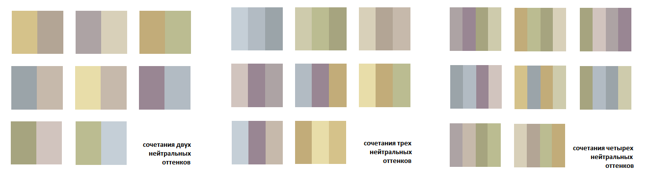
They also distinguish between bright and pastel colors. Bright ones will make the interior catchy, sunny, and pastel ones - softer and more unobtrusive. If you can't decide which color to choose, it is better to give preference to neutral shades. They will always be combined with any interior.
In order to avoid mistakes, it is necessary to study the table of the correct and incorrect color combination, and later it will be told about the dominant color in the interior.
The perfect combination of color in the interior.
At first glance, a suitable solution would be to finish the room in only one color. However, the result may not live up to expectations - the room may seem impersonal and monotonous. The following basic colors can be used to create a stylish and cozy room.
The use of white in the interior is appropriate in combination with bright furniture, decorative elements, textile attributes, and art objects. Without adding a bright note, white can make a room look dull and featureless.
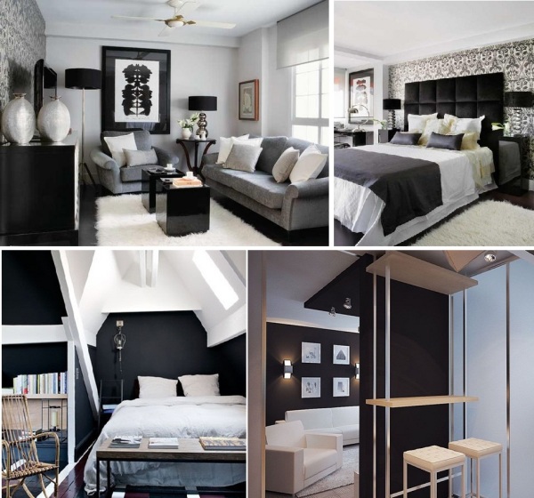
The use of black in large quantities can turn a room into a gloomy room with an oppressive atmosphere. You can dilute the black color with rich tones - yellow, green, pink. Do not decorate the nursery and kitchen in black.
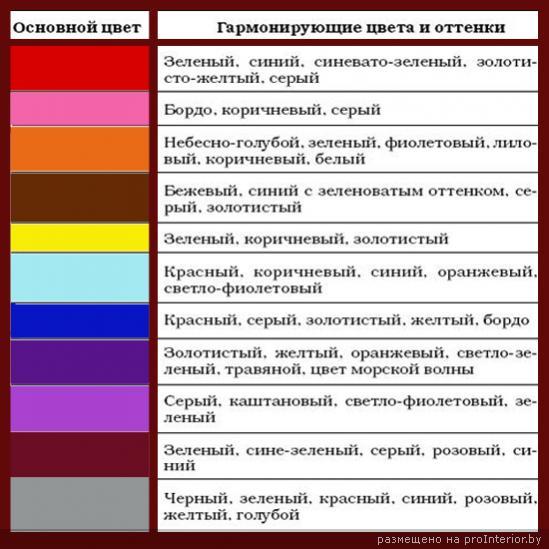
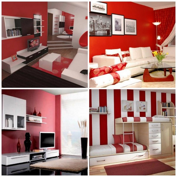
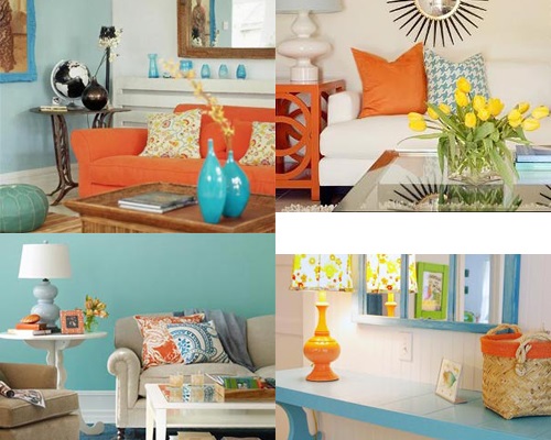
Red represents flame, passion, energy. You can dilute the main interior palette with red curtains, pillows on the sofa or other details, but the predominance of this color can make the atmosphere aggressive, annoying, especially you should not get carried away with the red color in the bedroom and nursery. The photo shows an example of the perfect combination of colors, blue, gold, pink, orange and black are also combined with red.
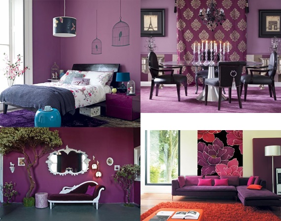
Purple is a rather controversial color, as it has light and dark, cold and warm shades. Dark, deep purples are usually not used in interiors; diluted tones are much preferable. But with dark shades of purple, you can successfully emphasize the style of the room. Combines with white, pink, silver, gray-blue flowers.
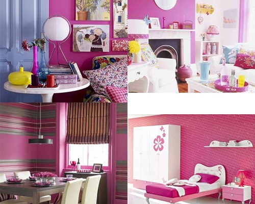
Pink is most often used not as a base, but as an addition to the dominant color. Pink has proven itself well in shabby style, country style, Provence style. It is delicate, it is in pink that bedrooms are most often decorated. Ideal for pink - gray, red, lemon, white, sand, chocolate colors.
The interior, made in blue and blue colors, pacifies and soothes, such colors give coolness to a hot room, and a small room in shades of blue seems visually larger. Complementary colors - red, gray, turquoise, white.
![]()
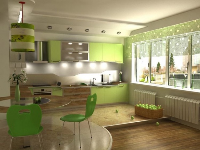
Green color - natural and natural, combined with light green, yellow, blue, black, lemon flowers. It relieves stress, promotes relaxation and rest, which makes it ideal for the bedroom, nursery, kitchen.
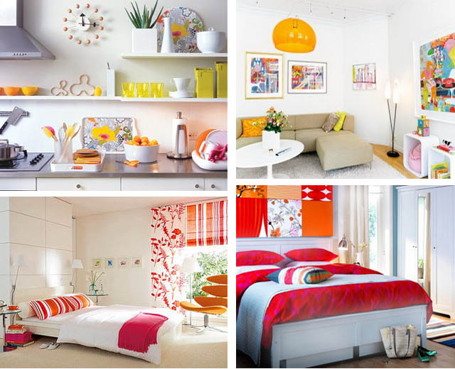
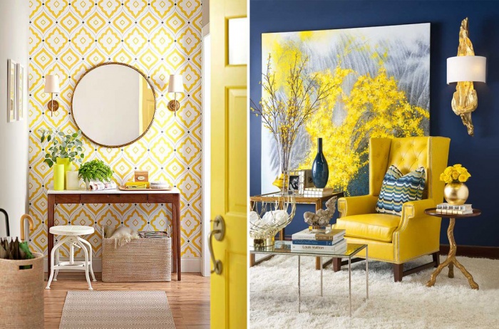
Yellow is the color of the sun, playful and joyful. The use of yellow is appropriate in any room, with the exception of small bathrooms and toilets, as in these options, yellow will seem too intrusive. Black, white, orange colors can be beneficially complemented by yellow.
Warm and cozy orange color suits almost any room - kitchen, living room, nursery, bathroom. However, you should not completely paint the whole room orange, the color can overwhelm with its energy. It goes well with brown, white, gray, green, yellow colors.
Brown and chocolate colors are often used to decorate workrooms. These colors help to focus, but light shades, on the contrary, relax, give the interior softness. Therefore, caramel, milky and beige shades are ideal for the bedroom. As complementary, you can use blue, white gold.
The right combination of colors can make the gray color less impersonal. It is enough to complement the faceless and boring gray color with bright accents, as it will sparkle. Gray color in the right combination can emphasize the beauty of color shades, dilute aggressive tones, make them cozy and soft. Ideal combination of gray with purple, pink, blue, black, green colors.
Thus, the study of combinatorics - the correct combination of colors, contributes to the creation of a harmonious, cozy and stylish interior.