The harmony of color combinations is quite important for many aspects of our life. After all, it is necessary to take into account the degree of interaction of various shades and color combinations in the interior, in clothing, in various types of art and in many other industries.
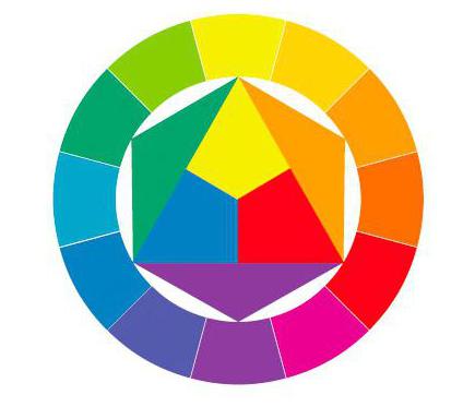
Itten color wheel
There is a certain scheme of basic color combinations. She is represented in a circle created by the artist I. Itten. You can see this circle in the picture below.
This model clearly shows the interaction of colors among themselves, the separation of colors according to the degree of primacy. So, there are basic and additional, you can also trace the order of their combination.
Combinations was developed to help novice artists to simplify the work with color. The circle taught the most harmonious combination of shades. It is relevant even today. The outer shell in the form of a closed circle contains twelve colors of the spectrum from red to violet. Red, blue, yellow are basic, that is, the main tones. All the rest, formed by mixing, are secondary colors. With further mixing, tertiary shades are formed.
However, it is clear that in real life we perceive and use a much larger number of shades. Therefore, the most complete model can be imagined in the form of a sphere, the poles of which will carry white and black colors.
The concept of color consonances
The laws of color harmony are based on the patterns of combinations and are the basis of the color composition as a whole. There are many of them. The schemes used to compose color harmonies are different in outline. The construction is carried out on the basis of a certain number of tones (two, three, four or more).
The use of such schemes will help you navigate the variety of shades and choose their desired combination.
Bicolor harmony color
It involves the compatibility of pairs of colors. These can be both adjacent and opposite sectors of the Itten circle. An example is a combination of opposites (complementary colors): red - green, blue - orange. All of them harmoniously interact with each other. Such compatibility is based on color contrast. It is also possible to combine tones that are extremely distant from each other (light orange - blue). 
tricolor harmony
It is also called the "color triad". Such combinations can be represented by various schematic options. With an adjacent combination (neighboring colors) and with a combination of similar colors (through one), harmonious color unions are formed. But the classic scheme is the use of triangles (isosceles and equilateral). In this case, harmonious color triads are formed (yellow, red, blue; purple, green, orange). Therefore, by inscribing any of these figures in the circle of Itten's color combinations and rotating, it is easy to determine the most harmonious union. As a rule, contrasting combinations are obtained. You can also apply linear variations from complementary colors to adjacent colors and so on.
Four color harmony
This is a more complicated option. However, such harmony is easy enough to imagine. Its color scheme is determined by inscribing simple geometric shapes, such as a square and a rectangle, into the Itten circle. It is also possible to turn on the trapezoid. With this combination, you get a black tone. An example of a four-color consonance: yellow, red-orange, violet, blue-green.
Harmony of six colors
It is formed by including an equilateral hexagon in the space of a circle. This is a rather complex harmony, the color scheme of which consists of six different shades. Mentally, it is quite difficult to make such a chain. Therefore, in this case, it is worth using the circle model. If we consider a sphere as a basis, then interesting color combinations can be achieved by spatial rotation. 
Color matching
The entire solution to the issue of choosing a tone depends on the goals, objectives and scope of a particular color. To solve design problems, there are their own characteristics, for the selection of a wardrobe - others. But one way or another, one cannot do without the use of color theory, as well as the concepts of how important harmony, color compatibility and general characteristics of colors are. With a conscious approach, it is quite easy to draw up the necessary compositional structure, relying on it.
Some of the tones that form the basis of the Itten circle have a number of features. Also, their distinctive feature can be called increased brightness and saturation. Spectral colors are not always used in their pure form. Often they are joined by achromatic black and white. And many of them are difficult to mix or understand.
For example, purple is a rather complex color. The color harmony formed with its use is quite interesting. It is formed by mixing light rays of red and purple hues. When choosing this or that tone to the existing one, it is important not to forget the rules for their combination, schematic models. 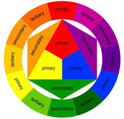
Color characteristics. Main
Each color has three main characteristics. These include saturation, lightness, and hue. It is also important to take into account the contrast (color and light) and the spatial effect of a particular color scheme. Color matching for any task should begin with an understanding of these properties.
The color tone is determined by the position in the spectral structure and determines its name (green, red). Hue allows you to reveal the difference between spectral and achromatic color.
Saturation is a characteristic that determines the degree of proximity to the ideal spectral color. The closer, the higher the degree of color saturation. If, for example, white or black paint is added to a color, a loss of saturation will occur. That is, in fact, saturation determines the degree of remoteness of a color from gray of the same degree of lightness.
The degree of lightness is a property of a color that determines its position on a scale from white to completely black. In everyday life, this property is also called brightness.
Color contrast is a concept that is often used by artists, colorists, and designers. It is based on the properties of contrasting colors, the degree of their interaction and compatibility. Contrasting hues enhance the saturation of each other, while having a great influence on each other.
There are a number of other terms used to characterize color. These are the concepts of intensity, sonority, degree of reflection. All components are variable, as they are directly dependent on the time of day, the type of lighting. 
Combination rules
It is necessary to adhere to the compatibility of no more than four shades (unless the direct task is to combine a larger number).
Achromatic colors, as well as gray, are versatile. Goes well with bright colors.
Whitened shades, the so-called pastel colors, as a rule, blend well with each other due to the generalizing element in the base (white). 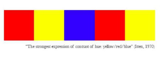
Related (blue - purple) combinations or complementary (red - green) combinations are considered the standard of harmony.
A good solution could be a combination (shades from the same segment).
Thus, puzzling over the choice of one or another color union, it is worth paying attention to the theoretical basis of coloring, taking time for color models and characteristics of the chosen colors.
In any industry, harmony is extremely important, the color structure of which affects the characteristics necessary to select the right combinations. This should not be forgotten.