Most people intuitively feel the harmonious combination of shades of different colors. Few people care if there is a poisonous green sofa in a room with pink walls. Most likely, these people suffer from visual impairment. A good color combination speaks to the taste of the owner of the tenant and, in many ways, about his character. When planning a renovation, you should think carefully about everything. In drawing up a project, a table of color combinations in the interior and knowledge of some design secrets will come in handy, about which in more detail - in this material.
Color harmony is the key to a successful interior
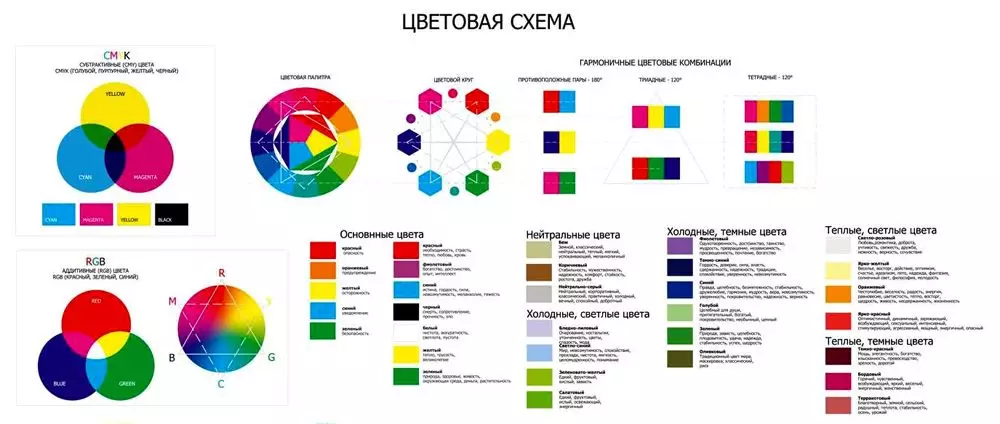
There are seven main colors, these are the colors of the rainbow. In smooth transitions and shades, only liquid crystal screens are capable of reproducing sixteen million colors, and human perception is available one and a half times more. Here you can get confused, how to be? How do you choose the right combinations from such a gigantic palette, and what should you avoid? It turns out that everything is not that complicated.
Psychologists, not without reason, argue that the range of colors can affect the mental and even physical health of a person. Scientists of the East have successfully practiced curing patients with serious illnesses with color.
The tones that you choose for the design of the room should match your character. For example, white represents spirituality and confidence.
But red is shown to people with blood problems. It helps to increase the number of red blood cells.
There is only one conclusion - you should not rely on only one color scheme. It is necessary to create a harmonious color combination in the interior that has a beneficial effect on the nervous system and well-being.
Kinds of color
All the variety of flowers in nature is divided into three subgroups:
- main - blue, red and yellow;
- secondary - the result of mixing the primary colors: green, purple, orange and the like;
- tertiary - the result of mixing a secondary and primary colors, for example, emerald.
But white and black are conventionally not considered a color, since they do not occur in natural conditions.
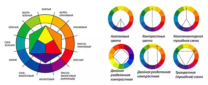
Another option for choosing a combination is to draw diagonal lines. Here, as they say, the unity of opposites will turn out.
Color palette color combinations and some important principles
There are several combination options.
| Monochrome | 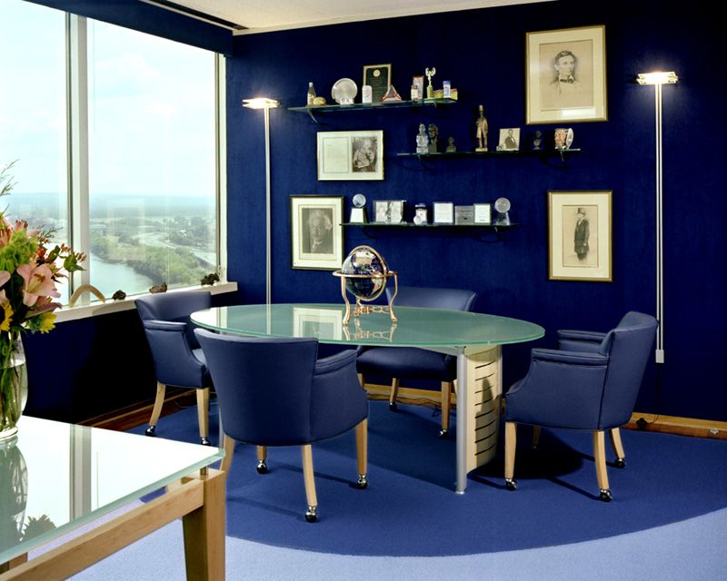 |
Using different shades of the same color. For example, pink is hot to pale. |
| Achromatic | 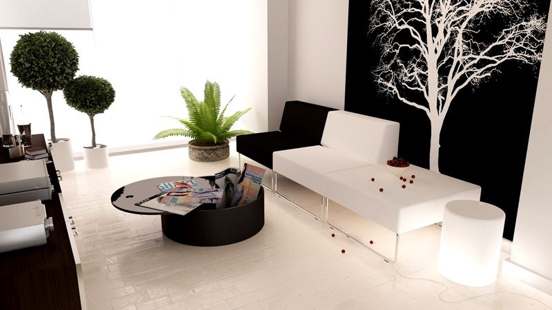 |
Designed in black-white-gray or black-and-white. The option is not difficult, but rather boring for the interior. |
| Complementary | 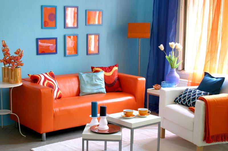 |
The use of contrasts, sometimes unexpected, but compatible. For example, yellow and purple. |
The black-white-gray scale in the interior should be diluted with some kind of color scheme.
Light pastel colors of cold "temperature" can visually increase the area of the room.
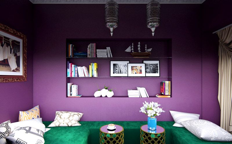
Using contrasting tandems in the design, you should choose one basic tone and select other shades for it. When selecting, you should not get too carried away. Too many colors will make the interior look like a gypsy motley. While this option is not in trend.
There are shades that do not tolerate the neighborhood. Do not combine dark hot tones and light cold ones. For example, dark burgundy and turquoise. Such tandems can adversely affect the psyche of the room dweller.
Yellow tones will help you focus on class, green will soothe a fidget, blue will raise a dreamer, and in a blue room a younger family member will feel lonely, especially if he does not have a sister or brother.
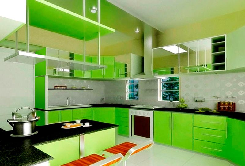
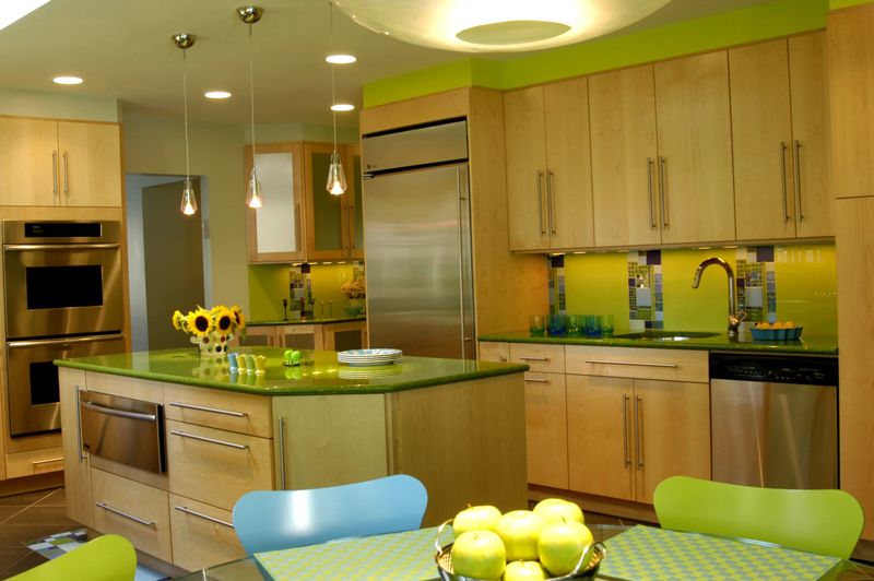
About the combination of colors in the interior of the kitchen: photos of delicious options
A good color combination in your kitchen interior should awaken your appetite. The photo shows the most successful combinations:
 Classic pastel colors - a universal option
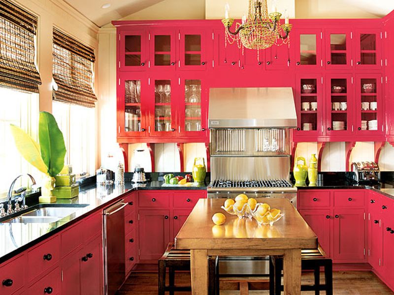
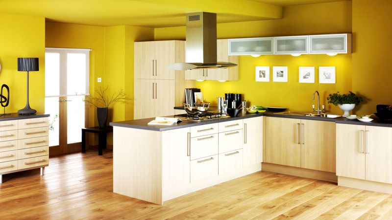
All shades of orange, yellow and green contribute to excellent mood and increased appetite. For comfort, it is worth adding red and blue, beige. But too saturated tones can have the opposite effect - to discourage appetite.
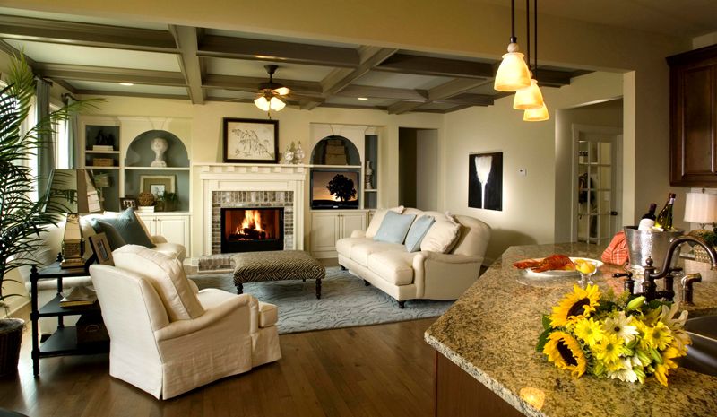
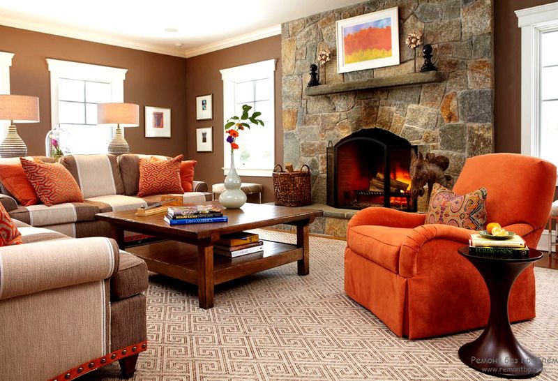
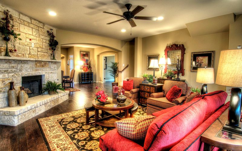
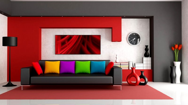
Caution from the living room
The living room is a place where, as a rule, the whole family and guests gather. Here you should select colors not for individual preferences, but rather universal shades that will not cause discomfort to anyone. For this reason, neutral soft tones, in light shades, are used for the living room.
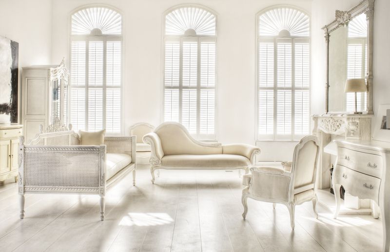
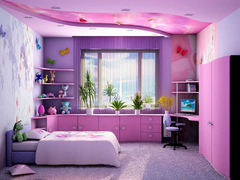
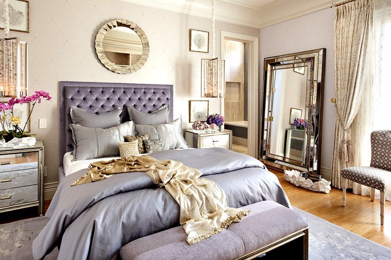
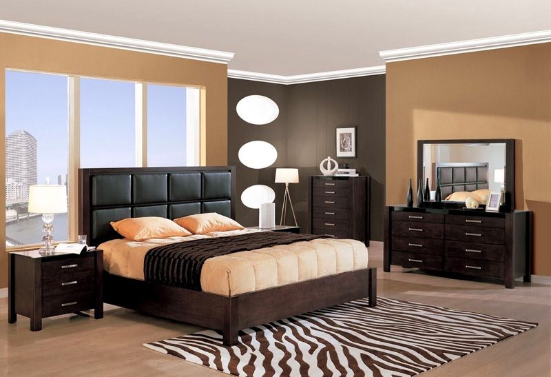
Personal space: bedroom
The color combinations in the interior of the bedroom show the character of its owner. You can use your favorite colors here, even if you suffer from the desire for black. But keep in mind that it will be difficult to create a relaxing atmosphere in a bedroom that is too dark or bright.
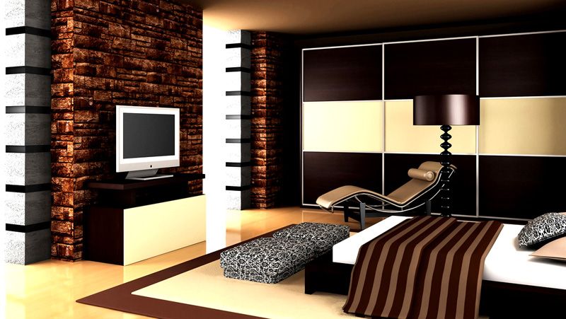
Combining shades using the example of wenge
Wenge is a relatively new shade in our interiors, but every year it gains more and more popularity. By the way, wenge is a species of tropical wood. Its classic shades have a hint of dark chocolate. Let's look at successful combinations and photos in the interior using the example of wenge color.
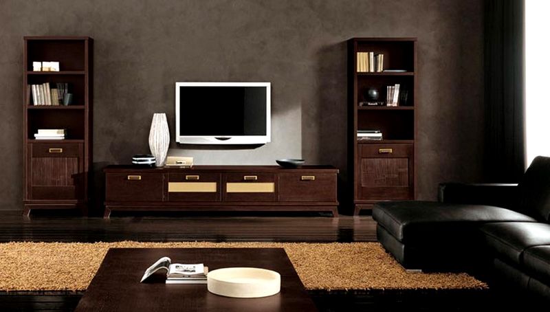
This shade is successfully combined with:
- all shades of milk, sand and beige;
- light pink and gray tones;
- orange decor.
Any of the combinations mentioned above should be supplemented with bright notes: turquoise, red or noble burgundy.
Wenge can be used in different ways:
- Floors in this tone look expensive, like in an aristocratic castle. It will be appropriate to pick up the doors in tone, they will harmoniously complement the set.
- Wenge-colored furniture is today the most popular product among many manufacturers. Such wardrobes or dressers, as a rule, do not contain unnecessary decor.
- Kitchen in wenge tones is already considered a classic. It gives the room a noble look. Here, in combination with shades of brown, stained glass can be used.
- If wenge is present on the walls of the room, you should select light-colored furniture that will look dignified against this background.
The only place where you shouldn't get carried away with this color is the bathroom. As a rule, the area of this room is not large, and shades of dark brown will make it visually even smaller.
Learn from mistakes
It is more profitable, of course, to learn from other people's mistakes, so let's look at the most common bloopers that home-grown designers make:
| White white | The solid white color of the room is boring. Considering that white can be combined with any color, add bright accessories, the mood will immediately change. |
| Walls of different colors | Zoning a room using different paints on the walls must be justified and carefully calibrated. In most cases, this technique is superfluous. |
| Passion for trends | If, for example, a blue-red stripe has come into fashion, it does not mean at all that everything in the room should be "streaked". You should use trendy combinations skillfully and not overload the interior with them. |
| Lack of attention to lighting | Before making the final choice in favor of a particular color scheme, check how it will look in daylight and in artificial light. You should especially pay attention to dark shades. |
| Gender doesn't matter | How much he has! The color of the floor attracts attention in the first place and affects the overall perception of the interior. The shade of this plane also needs to be correlated with the table of color combinations in the interior. |
| Equally divided | The main rule of designers is that the main shade takes up at least sixty percent in the interior. All other colors are only accents. |
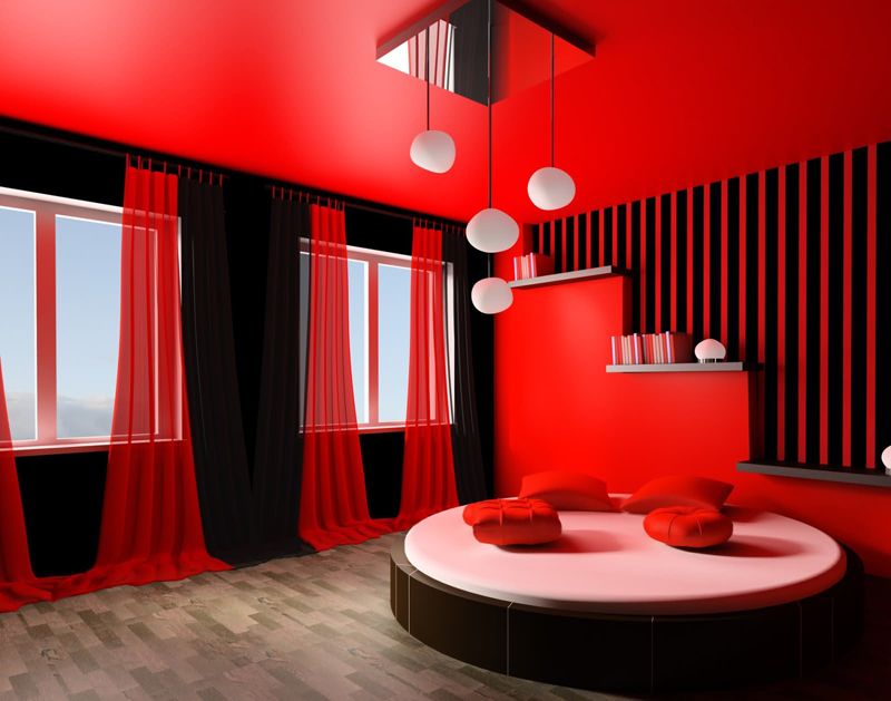
| Excessive contrasts | Carried away by contrasting combinations, it is easy to slip into bad taste. In addition, such a design can have a depressing effect on the psyche. |
| Passion for one color | If you love green, this does not mean that everything should be in shades of green. Such an interior, like pure white, will be boring and annoying. It should be thinned with other paints. |
| Decor and furniture in different colors | Furniture should be in harmony with the shades of textiles and other accessories. If you use a lot of variegated flooring and walls, you might miss out on a single style. |
| Excessive bright colors | Bright, saturated colors have an irritating effect on the psyche. If you are looking to add brightness to the interior, use accents, adding them in moderation. |
Every man to his own taste
A good designer can be easily recognized by the skillful combination of colors in the interior. You should not risk using dubious combinations, over time they can cause a lot of inconvenience and even affect your well-being.
Skillfully combining shades, using the recommended color combinations, you can visually change the dimensions of the room, create a relaxing, or, on the contrary, invigorating atmosphere. Listen to your intuition, choose your favorite tones and don't forget about bright accents!